


|
A good artwork is proved with the alphabets used within the design. Typography is an art without which every design seems to be incomplete. It is not a science, for which we need to follow any definite axioms and rules. Typefaces are designed to convey your creativity to others but every type cannot be used for any design. It won’t be wrong to confess that typography plays a major role in making any graphic design successful. However, sometimes the combination of color and typography is overlooked, which affects the overall project. So, have you ever tried black and white typography? I mean.. have you ever tried black and white typography? Well, I think black and white typeface can be more impressive than colorful typography….what say? Today, I present you 20 most amazing typography posters and illustrations in Black and White. These designs got me thinking that a cool black’n’white design can be much more expressive than a colorful one. We all know, anything in B&W can captivate viewers mind easily.
|
|
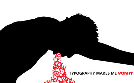
Overeating Typography: |
|
 |
|
|
|
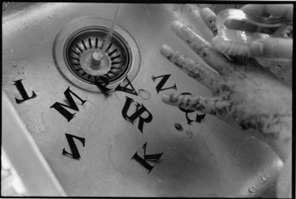
Wash away the TYPE: |
 |
|
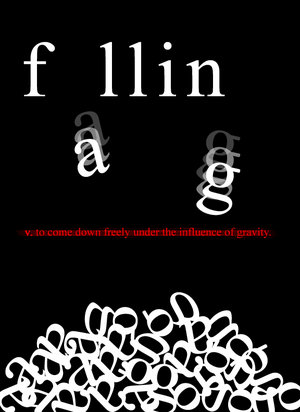
Falling: |
|
 |
|
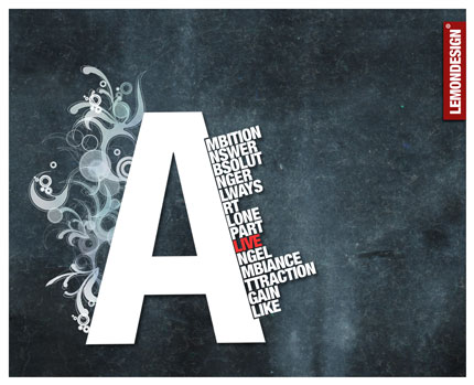
Typography with “A”: |
|
 |
|
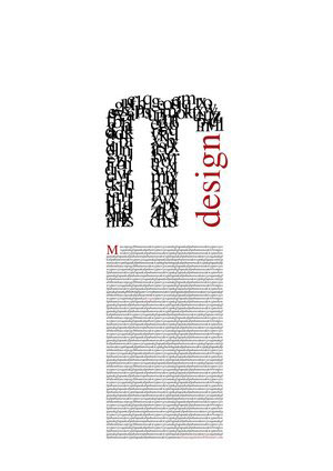
“M” Design: |
|
 |
|
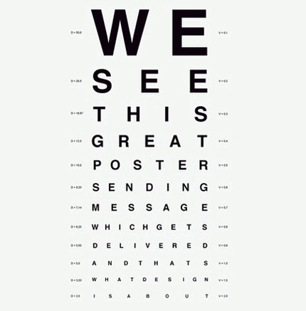
We See: |
|
 |
|
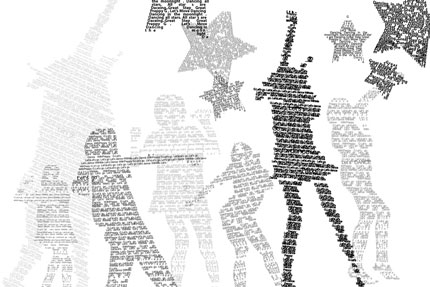
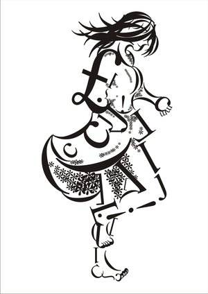
Dancing Typo: |
|
 |
|
Big and Bold Typography: |
|
 |
|
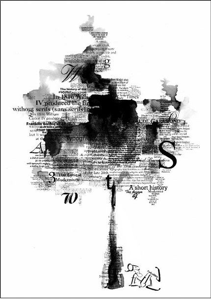
Typography Tree: |
|
 |
|
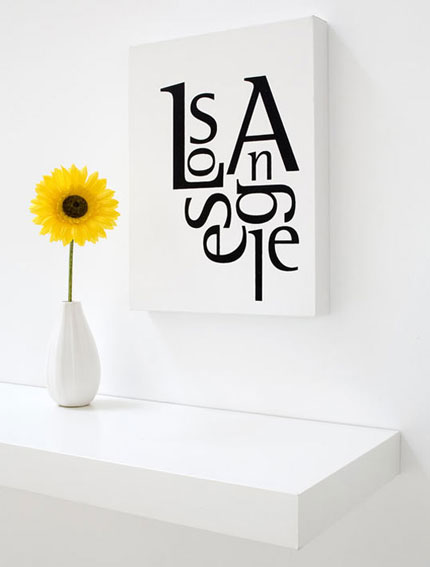
Los Angeles: |
|
 |
|
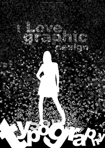
I love Graphic Design: |
|
 |
|
“X” and “Y” Typography: |
|
 |
|
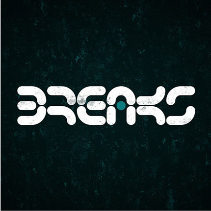
BREAKS: |
|
 |
|
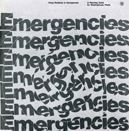
Typography Whirl: |
|
 |
|
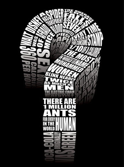
Question Mark? |
|
 |
|
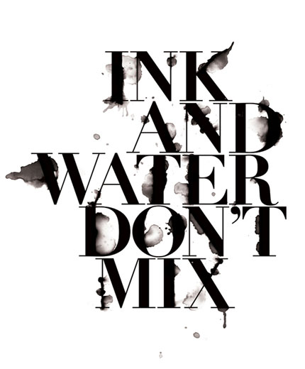
Ink and Water: |
|
 |
|
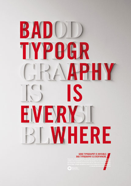
Bad Typography: |
|
 |
|
Art is Breaking: |
|
Girly Typography |
|
 |
|
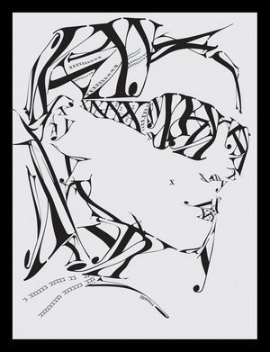
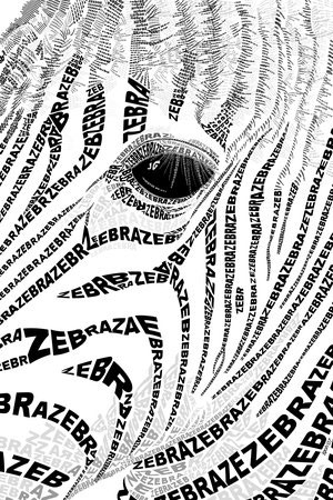
Zebra Print: |
|
 |
|
|
I am sure these images must have held back your thoughts for few moments as they transmit messages in the most simple and creative way. Therefore, I would like to know, how many of you think Black and White typography can be more impressive and persuasive than colored one. However, did you find these designs convincing enough to make you experiment your designs with Black and White typography…Send in your opinions and if you created something creative like the above given images, don’t hesitate to share :). |
|


Some could be left out, but most are great
Number 15 is my fav