istanbul evden eve nakliyat
X

Being a Female, What is your Clothing Style?


We can’t deny the exceptional value of colors in our life…Red is the color of love, blue is the sadness that drips from our eyes while Black signifies our evil side. Unquestionably, the world of graphic design wouldn’t have existed without colors. Being a graphic designer, we are well-aware that simply changing a color can make a logo design go from “good” to “bad” or “bad” to “good”.

However, many young designers do not realize the importance of color selection and irresponsibly pick colors by looking at Pantones or whipping out a color wheel. So, today I highlight the vital aspect of logo designing, explaining how colors contribute in making a successful logo design.

The Color Selection Process: Choosing the correct colors for your logo is a very critical decision as every color has a psychological meaning. A logo is not just a mark – it reflects a business’s commercial brand through the use of shape, fonts, images and most importantly color.

Many of you might find it very childish, with me explaining the value of color selection in logo designing but I think sometimes it is important to start from the scratch. So, friends, irrespective of our experience and talent, let’s recapitulate this process for the newbie.

 
This post educates you about the importance of color selection for a logo design along with 10 Logos tagged as “careless color selections” Some of these are world famous logos while others have been designed by new designers. With each logo, I have shared my reason for criticizing its color selection. If you don’t agree with my analysis, come up with some logo examples of “poor color selection”
 
1) Know your target audience: If you are a doctor, always advising your patients to stay clean, shades of blue and white can be your selection because people perceive it as clean. If you plan to have a business regarding financial solutions, colors such as dark blue (rich), green (color of money), gold or black will portray you stable and strong.
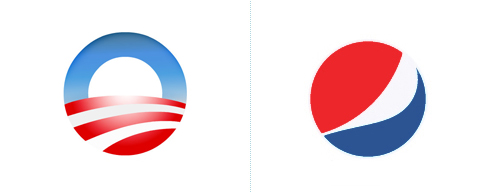
 

Obama Logo & Pepsi Logo:

Having the same shape and colors scheme make both the logos lose their power to stand out.
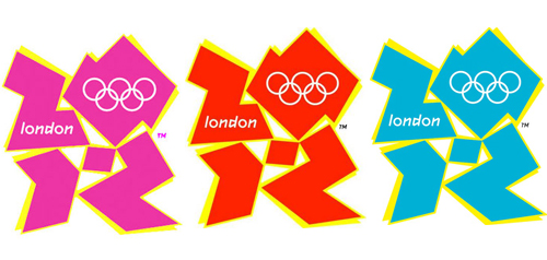
London Olympic 2012:

The logo has been released in four colors: pink, blue, green and orange but unfortunately none of the version reflects any design values

TATA Docomo

 
2) Know your market/services: Color scheme for your logo should noticeably project your clear and objective understanding of your business. Frankly, this can be more difficult than it might seem – particularly if you have been involved in your business from day one.
 
3) Should work best in Black’n’White:Most important rule for the success of a logo design is that it should give best results in “Black’n’White.” A very common mistake which many experienced designers even make is to impatiently add color to their design. So, always start your work in black and white and if it looks good in this form, it will surely turn out fine when put in colors.
 

AGA Building Logo:

The typographic concept is clever but a lighter color palette could have complimented in a better way.

Kraft Foods:

The colors of the new Kraft logo bear a striking resemblance to that of international chain of stores “Stop & Shop” and evidently fail to capture customers’ attention.

Enron:

Although the logo is one of the creations of “Paul Rand” but the uneasy color selection is making it very awkward.

 
4) Experiment in large color variety: Colors reflects the nature and personality of your business. Finding the right color combinations for your logo design project can be really hard. Therefore, to come up with a perfect color palette for your logo, it’s better that you analyze it closely by putting it in different colors. Try experimenting with the color scheme until it successfully portrays the aesthetic soul of your business brand and image.
 
5) Picking a color simply because it’s your favorite color – Your biggest mistake:Going out for shopping and picking up your favorite color t-shirt, seems to be an exciting idea. However, please don’t try this while designing a logo. It is a very immature approach which should be completely avoided while logo designs process.
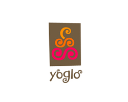
 

Yoglo:

This logo design is a proposal for a yogurt company but there is no co-ordination among the colors with two color tones being almost the same.

EDF:

It’s a CMYK Logo for an organization concerned with waste. However, a single color logo must have been impactful convincing people about least possible resources.

FIFA Worldcup 2006:

Although the colors depict the host nation, Germany but the color placement was highly criticized.

 
6) Putting in flashy colors can’t make you prominent: Surely, we all want our logos to be recognizable and appealing but a gaudy color logo is not the answer. There are numerous brilliant logos e.g. Nike, Coca Cola Logos, which are world famous although using single and dull color scheme. Use color to provoke feeling, not just to attract attention.
 
Although beauty is in the eye of the beholder but for the color selection in a logo design process, you need to be very selective. Inspiration can come from anywhere, at anytime. So always keep your eyes open and above mentioned points in your mind while deciding for color combinations.
 

  1. Graphic Design » Colors can change your logo design fate – 10 awkward color … On November 23rd, 2009 at 7:34 am
    1

    [...] See a strange post:  Colors can shift your trademark pattern predestine – 10 ungainly tone … [...]

  1. Colors can change your logo design fate – 10 careless color contributions!! | TopRoundups On November 23rd, 2009 at 9:03 am
    2

    [...] Colors can change your logo design fate – 10 careless color contributions!! Submitted by Editorial Team [...]

  1. Cort On November 23rd, 2009 at 3:58 pm
    3

    Creative Pro has a similar post on their site this week. Check it out. Both good stuff! Thanks.

    http://www.creativepro.com/article/how-use-color-effectively-your-designs.

  1. Laurent JOUVIN On November 24th, 2009 at 1:58 am
    4

    #3 is undoubtedly the most common mistake designers make. A logo design should always be started in black & white, on a piece of paper. Forget the computer, sharpen pencil and start sketching!

  1. Shailaja On November 24th, 2009 at 2:08 am
    5

    Very interesting post.

  1. Mia On November 24th, 2009 at 3:39 am
    6

    I couldnt agree with you more about bad choices in color schemes ( and fonts ! ) . I have seen so many badly designed logos ( and not only their color synthesis but their font type ) ; some of them have even gone as far as using Comic Sans ! it’s frightening ! :) I love the log below [ " Coffee " ] , I believe its perfectly done , despite the fact that it used just 2 colors ( and a hue ) its just perfect , as is the font type used . There are so many typographic logos which are incomprehensible that a user struggles in deciphering what it actually says - which I believe is one of the gravest mistakes a website , business or corp can make when creating their site . A logo should be clear & able to pass a message about what the site or product is about . Great post C. , Im sure it will enlighten many designers about making the right choice when designing their next logo .

    Best regards :)

    M.

  1. Austin On November 24th, 2009 at 5:26 am
    7

    Yes I too feel the colors are too badly used. I hope the first two for obama and Pepsi they might have thought of using the colors from the US flag. The rest no idea.

    I now understand the importance of color combination, But the thing which you said for Blue - representing sadness, I have a disbelief on that.

  1. Design Tweets of the Week #4 | Blake McCreary Design On November 24th, 2009 at 7:01 am
    8

    [...] Colors can change your logo design fate – 10 careless color contributions!! We can’t deny the exceptional value of colors in our life…Red is the color of love, blue is the sadness that drips from our eyes while Black signifies our evil side. Unquestionably, the world of graphic design wouldn’t have existed without colors. Being a graphic designer, we are well-aware that simply changing a color can make a logo design go from “good” to “bad” or “bad” to “good”. Submitted by Graphic Design Blog. Thanks! [...]

  1. Design Informer On November 24th, 2009 at 1:00 pm
    9

    So what’s wrong with the Obama logo?

  1. Clayton Shumway On November 24th, 2009 at 1:14 pm
    10

    Great post! It’s interesting the effect colors have on our perception and even attitude toward something.

  1. Trackback : Cheap car insurance quotes » Tips on getting cheap car insurance quotes ... On November 28th, 2009 at 9:29 am
    11

    (…) is one another relavant source on this subject(…)

  1. Urviho On November 30th, 2009 at 9:34 am
    12

    Yeh, colors are big mistery :)

  1. christmas shopping On December 1st, 2009 at 4:04 am
    13

    Great article, color is the main resource for any Design. It really rock if we have a good combinations.Thanks for such a great post here…

  1. business logo design On December 1st, 2009 at 11:49 pm
    14

    Good article.
    Good color combination is the attractiveness for any designs.
    Thanks for sharing.

  1. Alan On December 2nd, 2009 at 2:11 pm
    15

    I wholeheartedly agree with this article. Your logo should be able to stand alone in just black and white. Then you can experiment with adding color.

  1. Boom Truck On December 3rd, 2009 at 8:41 am
    16

    I love colors. Great article. Thanks for sharing.

  1. Logocolor: Dicas sobre a escolha da cor. « Jonathadapper On December 10th, 2009 at 12:15 pm
    17

    [...] Segue o link de um artigo que fala sobre cores em logos muito interessante: http://www.graphicdesignblog.org/color-contribution-in-logo-design/ [...]

  1. Logo Color On January 11th, 2010 at 8:58 pm
    18

    [...] brand, nor only a symbol for your consumers, but a symbol of you.  Here’s an interesting blog post on the importance of colors on a logo. The Color Selection Process: Choosing the correct colors for [...]

  1. How Good Design Helps « On January 18th, 2010 at 10:39 am
    19

    [...] Colour, font, graphics, illustration, photographic images, text and layout; they should all work together to create the “look and feel” you are going for. [...]

  1. InTouch » Blog Archive » How Good Design Helps On March 24th, 2010 at 1:48 pm
    20

    [...] Colour, font, graphics, illustration, photographic images, text and layout; they should all work together to create the “look and feel” you are going for. [...]

  1. Design Tweets of the Week #4 | Blake McCreary Freelance Designer On August 30th, 2010 at 6:23 pm
    21

    [...] Colors can change your logo design fate – 10 careless color contributions!! We can’t deny the exceptional value of colors in our life…Red is the color of love, blue is the sadness that drips from our eyes while Black signifies our evil side. Unquestionably, the world of graphic design wouldn’t have existed without colors. Being a graphic designer, we are well-aware that simply changing a color can make a logo design go from “good” to “bad” or “bad” to “good”. Submitted by Graphic Design Blog. Thanks! [...]

  1. Color is everything « Adobe Creative Suite User Group San Jose - Steve Dolan - Sally Cox On January 31st, 2011 at 12:36 am
    22

    [...] interesting article I found, on logo design and how the wrong colors can ruin a good design: http://www.graphicdesignblog.org/color-contribution-in-logo-design/ Tags: Color Did you enjoy this article? Share [...]

  1. asma On June 1st, 2011 at 7:59 am
    23

    Very useful … I wish there were examples of good logos mentioning why … not only not to brilliant ones

  1. Blake McCreary On June 26th, 2011 at 4:51 pm
    24

    That Obama logo has never set well with me. It just makes me thirsty haha.


Write for us
  • Top 10 Designers Projects Won
    AbsolutMudd
    217
    ACEdesign
    208
    finaldesign
    198
    neonlite
    192
    vector
    179
    x3mart
    158
    XtremeCreative2
    130
    Sergem
    124
    lakshmiks
    116
    jaggu
    99


Recent Post

Categories

Archives

  • Popular Posts

  •