


 |
|
|
The advertising world is packed with creative ideas and imaginative advertisement messages. The job of an advertiser is to effectively persuade the target audience into buying a certain product or service. Creative ads are the ones that have the power to sell. But there is a vast difference between generating a TV ad and producing a print ad. Print ads are hardest to execute because of the lack of space and freedom. Within a limited domain, you need to effectively place your message to the target audience. Hence, minimalist and conceptual print ads are helpful in serving the cause perfectly. In a print ad, less use of graphic design can yield more substance to the copy. This is where the services of a talented graphic designer come in handy. Following are 30 of the most stunning minimalist print ads that say more with less. |
|
ATM (Azienda Trasporti Milanesi) |
|
| The pieces of a puzzle show two people connected with each other, denoting that ATM is ‘connecting the city’. | |
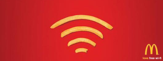
McDonalds – Wi-Fries |
|
| McDonald’s fries are shaped into Wi-Fi sign to show love for free Wi-Fi. | |
National Environment Agency Singapore |
|
| To highlight to Singaporean smokers that from July 1st 2007, smoking inside pubs, clubs and restaurants is prohibited. | |
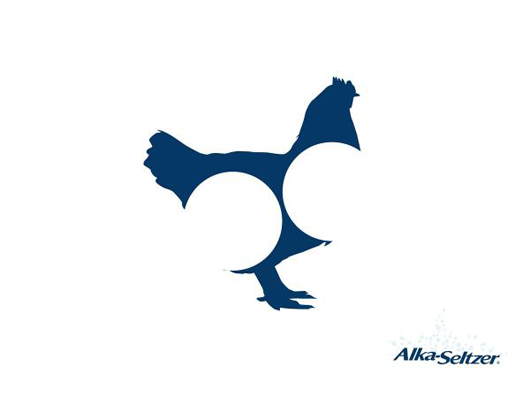
Alka Seltzer: Chicklhouette |
|
| This minimalist ad of an antiacid medicine shows that the pills can digest a whole chicken. | |
 |
|
MTV Networks: Black Ribbon Michael Jackson |
|
| Wonderful minimalist ad by MTV, showing a ribbon shaped into Michael Jackson’s legs. | |
CNN: Net |
|
| The spider web in this minimalist ad signifies that ‘No story gets away’ from CNN. | |
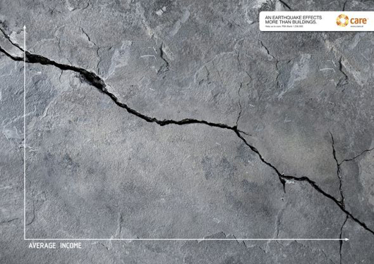
CARE Austria: Earthquake |
|
| An earthquake effects more than buildings. The graph shows that it affects average incomes too. | |
 |
|
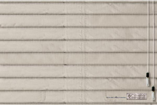
Columbia: shades |
|
| The commercial titled shades was done by Prolam Y&R Santiago advertising agency for COLUMBIA (FORUS Company) in Chile | |
 |
|
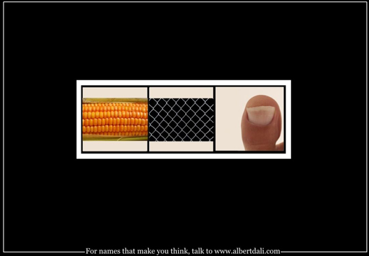
Albert Dali Naming Consultants: Corn-net-toe |
|
| For names that make you think. This add creatively spells out the word “Cornetto” | |
 |
|
FedEx: Statue of Sugarloaf |
|
| This ad shows a brilliantly colored Statue of Liberty with the FedEx purple and orange colors. | |
Financial Times: Paratrooper |
|
| The minimalist ad communicates that “Some tools aren’t a luxury. We live in FINANCIAL TIMES.” | |
The Green Ant: Minimalism |
|
| Minimalism is the art of continually removing things until all you have left is beauty. | |
MasterCard Canada: Darkness |
|
| The darkness ad exhibits the importance of blind people. To them darkness is priceless. | |
Hut Weber: Hitler vs. Chaplin |
|
| The ad tries to communicate that it’s the hat that is different between Charlie Chaplin and Hitler. | |
Jeep |
|
| This minimalist ad creatively shows the face of a dog and a camel merging to make a “JEEP” | |
Kapiti |
|
| Kapiti is a designer Ice-cream that is indicated by the vibrant graphic design created by the melting purse. | |
Kit Kat: Bench |
|
| The bench is made of Kit Kat, signifying that you ‘Have a Break with a Kit Kat’. | |
Nestlé Kit Kat: Vuvuzela |
|
| The ad shows the controversial horn used in FIFA World Cup 2010, communicating ‘Break a vuvuzela, have a Kit Kat’. | |
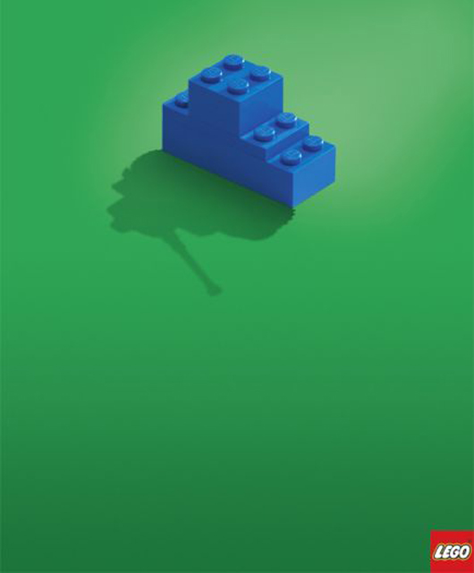
Lego: Tank |
|
| This minimalist ad communicates that LEGO toys can create real objects. The shadow shows a tank. | |
 |
|
Levis Slim jeans: |
|
| This minimalist ad communicates that the Levis Jeans just couldn’t get any slimmer. | |
McDonald’s road |
|
| Did somebody say ‘M’? | |
McDonald’s: Medium size |
|
| McDonald’s in Israel changed the menu to much less calories and fat. The M sign denotes the ‘Medium size’. | |
Nando’s |
|
| The ‘Extra Hot peri-peri’ Nando’s is so hot, it can put a hole in a chair. | |
Pepperoni Coke |
|
| Pepperonis are shaped into a Coke bottle on Pizza Hut’s new pizza. | |
Pilot pen: Mummy |
|
| Pilot pen is so water resistant that when written on dinner plates, it won’t wash away. | |
Profilo XXL Refrigerator: Lost Vegetables, Tomato |
|
| The 566 liters XXL refrigerator is so large that vegetables get lost in it. | |
Wite-Out spec: |
|
| The funny resignation letter amendment shows that this correction fluid is ‘For Big Mistakes’. | |
The support centers union for victims of assault |
|
| The use of negative space is this ad creates hand of a criminal (in black) holding the neck of the girl (in white). | |
Tzomet Sfarim Bookstore: Faceabook |
|
| This ad communicates that people should disconnect from Facebook for a while and read a book. | |
 |
|
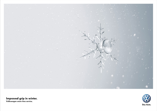
Volkswagen Snow Tires: Crystal |
|
| Volkswagen snow tires service have improved grip in winter. | |
 |
|
|
|


very nice list….they are really good..as you said”say more with less”…thanks for sharing