istanbul evden eve nakliyat
X

Being a Female, What is your Clothing Style?

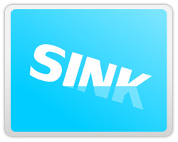
Yawn, yawwn, yawwwn. Hey friends…getting back to work after a relaxing weekend is the most difficult task for me:( I am sure, most of you will agree with me ;) Therefore, to keep myself motivated towards work for rest of the week, I try searching for extremely interesting topics on Mondays.

So, here is an exciting logo compilation of 30 logo designs showcasing movement. Demonstrating movement in a logo signifies the progress of a business and nowadays it is one of the latest trends of logo designing.

I want you all to have a close look at these moving logos and tell if you agree that the motion in these logos can convey company’s progress effectively.

   
      While appreciating the magic of clever and creative logo designs, we all get tempted to have such perfect logo for our own companies too but at affordable prices…right?? So friends, today let me introduce you all to a quality platform where you can create and get a perfect business logo for “Free”

      Using the resources available at Logosnap.com you can create a professional logo within 5 minutes and use it as your business icon without paying any charges. So guys what harm trying this free logo design service…..let’s give it a try.


Malabar Studio

Elastic Digital

Good Waves

Bird

Collective Feedback

Fly

Jump

Sinaps

Twizla

Zero G

Zip Liner

Brand Stack

Andy Fiord

Race

Sink

Action Now!


Lexpro


Ice Cream Love


H30 Creative studio

Oil

Travel World

Screen Grab

Dictionary of Australian

Color Trail

Nethir

Asgradia

URSO Wines

Binoche Palette


  1. GD On September 15th, 2009 at 5:21 am
    1

    You can delete this if you like, I won’t be offended, but SERIOUSLY! You’re advertising a fast-food logo site on a graphic design blog? I am seriously offended. Yes you can make stuff for free, but sites like this take away both business from people like me and the artistic integrity of our profession. It’s just sleezy.

  1. M1sternoname On September 15th, 2009 at 7:57 am
    2

    Nice collection. But you got Elastic Digital twice.

  1. Thompson Touch On September 15th, 2009 at 10:36 am
    3

    Lexpro and H30 are my two favorites thanks for the list.

  1. Elisa On September 15th, 2009 at 11:53 am
    4

    I love Ice Cream Love and Bird for sure! you have Elastic Digital on there twice.

  1. Michael Benin On September 15th, 2009 at 1:54 pm
    5

    If the movement is conveyed linearly left to right and aiming high to show progress. I liked goodwaves, travelworld, and screen grab, but it all depends on the company. Thanks.

  1. Arnold Dela Cruz On September 15th, 2009 at 2:52 pm
    6

    Nice collection of logos. Many of these look great in color, but they also break one of the foundational principles of logo design — reproducibility. I’m specifically referring to black and white line art and halftones. Although we are moving towards a more complete digital era, designers must not ignore print media. Nearly half of the logos presented here would not reproduce or translate very well in black and white or halftones. Some of the values, tints, shades and hues used in the color schemes are too close to translate into a very clear and high contrast mark even if just one color were used.

    In addition to the color treatments, the illusion of transparency and the use of gradients, while popular and trendy today, is lost in translation when moving from full-color to black and white.

    Keep in mind that we still have companies, vendors, customers, and clients who still use fax, advertise in the newspaper, or in the yellow pages. True, the time will come when none of these communication tools will be around, but while they’re here, logo designers must be cognizant of them when creating a mark.
    Just my two cents. For more thoughts and opinions, click on my name to visit Design Democracy, the “Facebook for Designers”. And follow me on Twitter (@StandUP4Design).

    Thanks for letting me share my opinion :)

  1. Charlie B. Johnson On September 16th, 2009 at 1:17 am
    7

    Hi ARNOLD DELA CRUZ, THOMPSON TOUCH and MICHAEL BENIN …thanks for appreciating this collection of “30 Logos showing Movement” @ M1STERNONAME and ELISA…I want to excuse for repeating the “Elastic Digital” logo. I have replaced the repetition by adding the “SINK” logo…it is another brilliant example of moving logos. @GD…my friend I never delete my readers comments, no matter if they are criticizing my blog because I believe criticism helps us succeed. But my fr1end please tell me which “Fast Food logo site” are you referring to which I am I promoting through my graphic design blog?

  1. GD On September 16th, 2009 at 5:53 am
    8

    Logosnap.com is a “fast food” logo site. It tells companies that it’s okay not to have an individual logo or a logo specifically designed for them, that it’s okay to half-ass something like their identity.

    It’s bad enough I need to justify my services on a weekly basis, but to see someone in the graphic design field shilling for such a company is really hurtful.

    There are two great arguments here and here.

    Basically, why would someone pay my fees (which take into account my training, computer programs, computer, and talent) when they could get a free McLogo, with all of the cheap taste and lack of substance?

  1. Charlie B. Johnson On September 17th, 2009 at 2:14 am
    9

    @ GD…let me clarify you a little here my friend. You are completly misunderstanding the services provided by Logosnap.com

    It aims to provide a platform to small business owners to come up with a corporate icon of their choice. We all have a creative image for our business logo but at times we fail to convey our requirements to the designers.Therefore,Logosnap.com gives you an oppurtunity to give life to your ideal corporate logo.

  1. GD On September 17th, 2009 at 5:40 am
    10

    I don’t know what you mean by giving “life” to a logo. Last I checked designers were needed because while a small business owner may know what they THINK they want in a logo, they do not have the knowledge of what makes a good logo. Telling a small business owner that they can make a good logo for “free” (and then need to pay $60 to finalize it) is as good as telling me that I can cut my own hair. Yes, it CAN be done, but other people are going to know that I was too cheap to pay for the real thing.

    I am sorry, but I really don’t believe that anyone on this site is a true graphic designer. I thought we could have a real discussion about this, but honestly, I think I’m just helping your SEO. I mean, today your entire post was just about the company you advertise for.

  1. Margo On September 18th, 2009 at 1:04 pm
    11

    I think there are some really talented people out there. I wish I could even think of these concepts, let alone execute them so well.

  1. Kaplang On September 19th, 2009 at 1:14 am
    12

    wow i love looking at others work, these are really cool :)

  1. Laurent JOUVIN On September 30th, 2009 at 12:23 am
    13

    The comments on this page are almost as interesting and entertaining as the logos. I really enjoyed reading Arnold Dela Cruz’ comment, as I completely share his point of view. There are still some fundamental rules and guidelines that have to be regarded when creating and designing logos.

  1. BlindAcreMedia On October 1st, 2009 at 2:02 pm
    14

    The more I look at these, the more I realize that most of these are really colorful. Movement is great and sometimes hard to achieve depending on the logo you are working with. Good Examples…It would be cool if these also had sounds with them , too!

  1. Clippingimages On October 6th, 2009 at 6:36 am
    15

    All these logos are so colorful! Movements are so greatly elapsed to create a dynamic look.

  1. What Makes a Good Logo? | ukre8 THE VS PROJECT On November 4th, 2009 at 8:39 am
    16

    [...] post on Graphic Design Blog showcases logos that show movement. While it displays a decent set of logos, a number of them break from the foundational principles [...]

  1. r4i On November 11th, 2009 at 8:02 am
    17

    Nice compilation! I’m struggling for a logo design now and these are inspiring. I’m going to ditch my sketches so far and see if I can do better.

  1. tri-fold brochure design service On March 15th, 2010 at 1:16 am
    18

    Creatice logo compilation. Really interesting post. Thanks….

  1. vishakha On November 11th, 2011 at 3:07 am
    19

    agree with arnot as about the adaptation of the logos to various mediums BUT besides that the look and the feel of the logos featured are very inspiring and refreshing. keep it up guys!

  1. vishakha On November 11th, 2011 at 3:12 am
    20

    sorry i meant i agree with arnold dela cruz.spell error regretted!

  1. Scott On March 30th, 2012 at 2:52 pm
    21

    Most of these logos are really colorful. The movement is great and I know it is hard to achieve. These are really good examples.


Write for us
  • Top 10 Designers Projects Won
    AbsolutMudd
    217
    ACEdesign
    208
    finaldesign
    198
    neonlite
    192
    vector
    179
    x3mart
    158
    XtremeCreative2
    130
    Sergem
    124
    lakshmiks
    116
    jaggu
    99


Recent Post

Categories

Archives

  • Popular Posts

  •