istanbul evden eve nakliyat
X

Being a Female, What is your Clothing Style?

30 Interesting Male & Female Logos – The battle of genders!!
Image Source
 
A logo design should always be shaped keeping the purpose in mind. An effective logo design is one that can portray the essence of the business in a graphically creative manner. While many businesses are associated with many consumer goods like cosmetics, sports and garments, but there has always been segregation between male and female products.
 

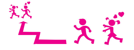
Masculine logo designs are used in various sports merchandise, bodybuilding gyms, office clothing, and barber shops. On the other hand the more delicate type, feminine logos, are used in various women businesses like hair salons, spas, beauty parlors, cosmetic shops and female garment stores. While many of us would squabble on the discrimination aspect, but having a logo design that is gender specific helps target the audience in a better way. Logo designs with male figure can signify dominance and power while the use of female figures in a logo may portray delicacy and sensitivity.

Witness the historic “Girls Vs Boys” rivalry battled out with 30 inspirational male and female logos:


Female Logos: Male Logos:
   

Canary Models


Far Out


Woman’s Entrepreneurial


Beauty Rules


Ms Photogenic Nigeria


bongiwe walaza


Primd


Yoga Australia


Designers Only


La La Handbags


Angle Face


Paradise Island


Gel’s Kitchen


Ballet de la Louisiene


Girl World


Modern


Guia Varonil Magazine


Mister Devil


Men’s Fellowship


Prost!


Razorss


moustache lovers


Suits You sir


MVS


Rowdy Gear


God’s GYM


Invisible Agent


What ever Men


Joe Farmer


Cazadores


So which logos do you feel are more expressive? Do the Male logos express their dominance or the delicate Female logos look more appealing?


Resource Box:

http://logopond.com/
http://www.logofromdreams.com/
http://logofury.com/
http://logomotto.com/
http://brandstack.com/logo-design/


  1. Yanne On March 16th, 2010 at 11:29 am
    1

    Nice post. From this list, I have to say I like the male side more. God’s Gym and Invisible Agent logos caught my eye.
    Modern and Mister Devil logos are quite similar by the way.

  1. Chase Mann On March 16th, 2010 at 11:40 am
    2

    1st -Moustache Lovers -Great colors and symbology.

    2nd -Guia Varonil -Great use of initials and shape.

    3rd -Invisible Agent -Love the simplicity of it.

  1. Ally On March 16th, 2010 at 12:23 pm
    3

    I like the invisible agent logo and the Yoga Australia logo

  1. Ally On March 16th, 2010 at 12:23 pm
    4

    You should have included the Mother and child logo though.

  1. Emil On March 16th, 2010 at 2:57 pm
    5

    In general, I would say the women logos are more elegant and artistic, whereas the male are more consise.

    It also seemed tha male ones had more embedded glyphs and such.

  1. FW Design On March 16th, 2010 at 4:51 pm
    6

    This has given me loads of inspiration, some really great designs here, Thanks

  1. Davey Boyd On March 17th, 2010 at 12:02 am
    7

    1st in my opinion goes to Gazadores
    2nd goes to Prost!
    3rd goes to La La Handbags

  1. ammar hassan On March 17th, 2010 at 2:04 am
    8

    all are nice, but i like the bongiwe Wilaza and prost the most

  1. TwittLink - Your headlines on Twitter On March 17th, 2010 at 2:41 am
    9

    [...] Tweets about this great post on TwittLink.com [...]

  1. Yvo Jolie On March 17th, 2010 at 4:35 am
    10

    Great round-up! But I think there’s a little mistake made.
    “Gel’s bitchen”, I guess it’s supposed to be “Gel’s kitchen”.

    Still a great list!

  1. acekard ds On March 17th, 2010 at 5:15 am
    11

    Wow…What a pretty cool logos here.I have enjoyed a lot to browse all of it.I have bookmarked all of these logos for further use.Thanks.

  1. Sneh Roy On March 17th, 2010 at 6:24 am
    12

    Thanks for the mention Charlie! But it is Gel’s Kitchen :) Nice roundup!

  1. tri-fold brochure design service On March 17th, 2010 at 6:43 am
    13

    Good logo compilation. From this list, I have to say I like the female side more. Bongiwe walaza and Beauty Rules logos caught my eye.
    Thanks!!!!

  1. Jack On March 17th, 2010 at 7:05 am
    14

    that’s awesome worked logo designs collection. These logo designs are so pretty.

  1. Creative Web Designers On March 17th, 2010 at 7:48 am
    15

    Really nice to see some thing new, Thanks for sharing battle of gender

  1. Susi Schuele On March 17th, 2010 at 1:20 pm
    16

    In my opinion, a clean and simple design, whether male or female, is more eye catching than a cluttered or overly-colored logo. I love the clever use of words and graphics as in the Mister Devil and Moustache Lovers logos. but I have seen some equally creative and clean feminine logos. I don’t think the gender matters as much as the overall design and appeal.

  1. paola lozano On March 17th, 2010 at 2:03 pm
    17

    Great examples, some of them well synthesized and some apply more like illustration i belive.

  1. TachyMinds On March 18th, 2010 at 6:01 am
    18

    beautify & creative logos.Great.

  1. Carlos Martínez On March 18th, 2010 at 5:12 pm
    19

    So in many of those I see that if you want to convey femininity: Go for the hair; Masculinity: a tie.
    My favorite: Yoga Australia.

  1. nEw tO tHe sEeN On March 18th, 2010 at 9:43 pm
    20

    i feel that a lot of these work especially the Guia Varonil Magazine, i feel that it is great use of expressive type.

  1. Security System On March 20th, 2010 at 3:15 am
    21

    Awesome designs! These logos are great. I now have to really think of revisiting this website again and find one great logo for my firm.

  1. Adam On March 22nd, 2010 at 12:04 am
    22

    thanks for putting this together, some of these designs are really terrific!

  1. kendradaveen On March 22nd, 2010 at 11:50 am
    23

    What would be more interesting is a look at male vs. female logo design of more gender-neutral brands. Clearly, brands that are targeted at women, such as a hair salon, will be feminine & one for say a men’s clothing store will be masculine. I wonder what could be found out there between as I said more neutral brands…

  1. vbpoutsourcing On March 22nd, 2010 at 3:10 pm
    24

    This post is very interesting because earlier today I read in order to market effectively companies have to keep in mind, you cant market to men and women the same way. Proof!!

  1. Bookmarks for March 22nd through March 24th | For My Own Amusement On March 22nd, 2010 at 9:15 pm
    25

    [...] 30 Interesting Male & Female Logos – The battle of genders!! | Graphic Design Blog -… - [...]

  1. Logo Design Gear On April 5th, 2010 at 9:03 am
    26

    Wow! these are nice logos.
    The logo I like best are,
    1)moustache lovers
    2)Also love the Gel’s Kitchen logo
    These are very creative logo. I like it.
    Thumbs up :)

  1. Jae Xavier @ Knowledgecity On April 7th, 2010 at 5:30 pm
    27

    lol… “Whatever Men” and “Rowdy Gear”

  1. Johnson Koh On April 18th, 2010 at 11:47 pm
    28

    Very cool collection of logos. Guia Varonil Magazine look especially GOOD!

  1. Jhon Frank On June 24th, 2010 at 3:54 pm
    29

    very creative work nice i really like last one “Cazadores” and also like “What ever Men”

  1. Security Camera Systems On July 23rd, 2010 at 9:47 am
    30

    Very nice designs! I love the JoeFarmer logo. I will be calling you guys when I need my next logo.

  1. Sleep Positioner On December 9th, 2010 at 5:16 am
    31

    I really think this is great stuff, especially with all the comments to follow up. I am just redesigning the logo for my site so very helpful for me.

  1. Toddler Sleep On December 13th, 2010 at 5:05 am
    32

    The Angel Face design is especially good. I love the linear lines used to represent something that is anything but linear!

  1. Nichole Heroman On December 31st, 2010 at 5:02 am
    33

    You made some nice points there. I looked on the internet for the issue and found most individuals will go along with with your blog.

  1. iphone On June 21st, 2011 at 10:20 pm
    34

    The Butterfly and the Beauty Rules logo are too good.. really liked them.

  1. Best PAMM Account Forex On February 23rd, 2013 at 2:46 am
    35

    Logo Designing is not as simple as people feel, I read your post and analyzed that your skills in logo design is superb. You have the creativity required for designing of a great logo. I am going to bookmark your blog and waiting for your new post please share


Write for us
  • Top 10 Designers Projects Won
    AbsolutMudd
    217
    ACEdesign
    208
    finaldesign
    198
    neonlite
    192
    vector
    179
    x3mart
    158
    XtremeCreative2
    130
    Sergem
    124
    lakshmiks
    116
    jaggu
    99


Recent Post

Categories

Archives

  • Popular Posts

  •