istanbul evden eve nakliyat
X

Being a Female, What is your Clothing Style?

I am sure my topic will bring you to a halt for a moment and make you think how true this statement is. Well, you must be wondering what made me think this way. Lately, while looking at some major redesigned logos taking place during recession, I noticed a particular strategy, which I believe is meant to stand tough against recession’s strong blows.

As Douglas Bard, manager of strategic partnerships at the Pennsylvania firm Logo Design Guru, puts it this way.

 
"It is happening on a lot of levels. Some clients want to convey a more positive image because of the tone of politics in Washington. But more are looking to find a way to reach people as we ride out the bottom of this historic downturn,"
 

Precisely, what I mean to prove is that big corporate brands are redesigning their logos and packaging with a new approach…trying to make their customers feel better in such hard times. They want their logos to be livelier and welcoming; telling their customers that

“We feel your pain. Let’s be friends."

I have listed few elements which I have been noticing repeatedly in some of the latest redesigned logos. I strongly believe that corporate brands are deliberately adapting this new approach to express their concern and support.

Please don’t think I aim to categorize any of these redesigned corporate logos as good ones or bad ones..just trying to convey new concept. I want you all to study these redesigns with new perspective and share your comments to tell if we can fight back adverse effects of recession with this new approach?


• Lowercase:

We all know “Upper Case” equals dominance and shouting. Companies have got their logos in lowercase to deliver their message in a softer and hospitable tone.
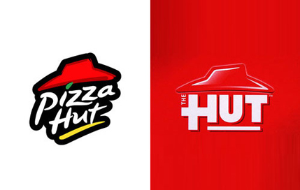
Burger chain Jack in the Box has redesigned its logo, showing loose typeface for the word Jack.
Capital bold fonts of the old Kraft logo have been replaced by the lowercase text, adding a soft and welcoming look to the logo.


• Brighter colors used:

When you think of Orange Juice you’re likely to find yourself thinking about Tropicana. With all the negative aspects of the redesign, you will find it more refreshing and colorful.

Pizza Hut restaurant chain has also redesigned their brand by taking out the “pizza” leaving “The Hut” behind.


• More casual and soft appeal:

One of the biggest rebranding of history took place this year when Pepsi Co revamped their logo, after their sales drop between 2% and 5% in various beverage categories.

Baby Johnson’s redesign is not a very obvious one but the new, softer look is more appealing.
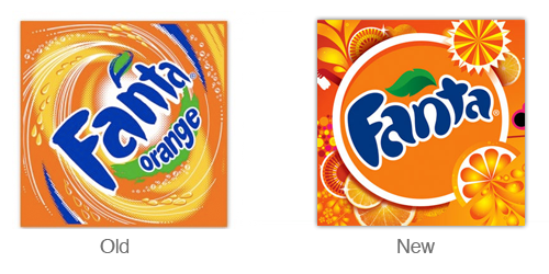


• Informal symbols added:

The economic downturn has vastly expanded Wal-Mart’s core audience. With a more casual and inviting redesign, people claim it to be a good recessionary buy.

Looking at the Fanta logo redesign, we can witness how orange swirls and waves make the drink more irresistible and refreshing.


• Repackaging of Brands:

Brands want their customers to feel good about acquiring pleasant things in their shoppers when back from malls. Therefore, clean, simple and minimally decorated packagings are considered presently.


If you all think I am exaggerating these redesigned logos, step ahead and prove me wrong but with a logical example.Do write in to tell us if you think this approach is workable and will help us in this tough economy. However, just remember these lines by Paul Rand:

 
“Good design is Good for Business.”


  1. Sean On June 24th, 2009 at 11:05 am
    1

    Thanks for the fascinating article, I never thought of these redesigns like that. This has definitely given me ideas about the logo I’m about to design…

  1. guylaine rondeau On June 24th, 2009 at 11:11 am
    2

    wow… i am really surprised by some of those!

    rebranding a logo completely from scratch when you have so much equity in your existing one is, well, surprising to me. not that some are not well done, but when there’s nothing left of the old one, i wonder what effect THAT will have. (like the kraft logo)

    new packaging is good – and if it doesn’t sell, you can always redesign it again. no biggies there. just lost dollars.

    / guylaine

    ps. i’m not getting the pepsi logo…

  1. Jordan Foutz On June 24th, 2009 at 2:23 pm
    3

    I wholly agree with the thinking here. There are a different set of rules in play these days w/ this recession. These companies get it. The only one that might not be completely applicable would be Fanta.

  1. Online Printing On June 24th, 2009 at 8:00 pm
    4

    Pizza Hut changed their logo? I think the former one looks more, uh, “recession-friendly.” And I like Pepsi’s old logo too. I can’t seem to grasp the idea of the changes they made. Just my opinion though.
    But I love JITB’s new look. :)

  1. blkjck On June 25th, 2009 at 2:49 am
    5

    Good design. Very impressive.

  1. franz On June 25th, 2009 at 5:12 am
    6

    Company courage needed to substitute the market-brand logo to the newest one….but I love it… :P
    nice blog…

  1. Graphic Designer Suffolk On June 25th, 2009 at 7:38 am
    7

    Nice thought, but a redesigned logo still needs adequate promotion to support it.

    Its a good tool for client retention.

  1. lecritducube On June 25th, 2009 at 8:14 am
    8

    Very interesting point of view ! As Guylaine, I’m not getting the Pepsi logo neither. Is it kinda sarcastically smiling ?

  1. mysticdave On June 25th, 2009 at 8:59 am
    9

    Well, re-designing is nice and everything, but as far as i am concerned, these big company’s are the problem to begin with. They want to be so recession friendly huh, then why don’t they move their jobs back to America, instead of making more money in some small third world country where labor is exploited to save money. That would help the recession, but i guess they are too busy white washing their image so they can continue raking in the profits……just my opinion of course…. :)

  1. Anna Green On June 25th, 2009 at 10:34 am
    10

    This a good strategy… Once the economy picks up i can see companies going back to there older retro logos, giving people a old strong image that they now and trust.

  1. phar_fetched On July 1st, 2009 at 6:17 am
    11

    Given that most of the redesigns are food based companies I think a growing concern over unatural products in foods is also worth taking into consideration. Kraft, Tropicana and even Johnson and Johnson have incorporated a more natural, and therefore more eco-esque style to thier designs so while they have indeed made thier brands more accessible to a downtrodden consumer they have also attempted to step up a level of trust.

  1. Andy On July 2nd, 2009 at 3:57 am
    12

    Thanks for the article, re-designing is nice & very good thing.

  1. Tabitha Kristen On July 2nd, 2009 at 11:34 am
    13

    I’m not really fond of Gatorade’s broken up repackaging. It’s too choppy for me and seems a bit confusing. Instead of reading it as a whole word or phrase, I’m reading it like it’s written and it doesn’t make any sense. Thumbs down on that one.

  1. guylaine rondeau On July 2nd, 2009 at 10:09 pm
    14

    well, the public has spoken: (at least in one case)
    http://tinyurl.com/mj3jd2

    (just saw this and thought i’d pass it on. it’s nice to design pretty stuff but from a business point of view it’s far from being a marketing strategy! people too often negate the importance of established branding)

  1. Kyle Gile On July 3rd, 2009 at 9:13 pm
    15

    I think re-designing a logo is a good way to get people to recognize your company once again. It just makes it look refreshed and like you are trying to change for the better.

    Keeping with the same design for such a long time can be good, as it will be easily identified, however keeping it for too long also I think will have some negative effects.

    I don’t see anything wrong with the new Pepsi logo. I think it looks much more better than their old one. The new one looks a bit more modern in my opinion.

  1. Sneh | LBOI Blog On July 7th, 2009 at 2:02 am
    16

    Except Jack In The Box and Fanta .. all other logos were better off not being rebranded. WalMart for eg is a HUGE chain … having WAL*MART splashed boldly on huge malls in chrome or lighted up letters is not only regal but also good marketing .. making the letter softer and adding a very amateur burst at the end makes it “not memorable” IMHO. Pizza Hut’s old identity was fun, trendy, casual .. the way it is meant to be in take-outs and pizza .. the new logo looks unfinished, the red look more like a floppy hat. Kraft’s new logo again blends in the masses .. when you are targetting a consumer who is staring blankly at a shelf full of products, you want your logo/brand to be eye-catching, not blend away with a mark that is barely visible.

    I think for highly established, world famous brands, the focus should be on re-packing rather than re-branding and also add-ons and enhancements to the current brand. In this fast paced world of thousands of new products hitting the shelves every other day, you are wise to not confuse the consumer, who if not very news-savvy might just take your new logo to be a spoof-competitor and give your product a miss.

  1. Trevor Collins On July 10th, 2009 at 1:54 pm
    17

    I think that all brands need to be refreshed from time to time. If nothing else it might give a boost to sales by implying that the product has got better.

  1. Juan Sebastian On July 10th, 2009 at 10:56 pm
    18

    nice information, you are completely right, redesign helps not only to refresh and modernizes a brand but it helps to transmit the idea of a renewal inside the company, so they’re more likely to know how it has changed.

  1. ash On July 16th, 2009 at 8:39 am
    19

    I don’t like Pizza Hut’s new one. It looks like the designer left it and never came back to finish it. The “in the box” portion of the Jack in the Box logo seems to get lost. I understand why it’s there, I just don’t think it works. I can’t seem to like the new Pepsi logo. The one on the right looks like some overweight guy with a red shirt and blue pants with his belly sticking out. I think my favorite is Kraft’s new one.

  1. Mohsin Ahmed On July 17th, 2009 at 12:26 am
    20

    i did not get the idea behind new pepsi logo , rest are fine…
    and agreed with SNEH .

  1. calgary graphic design On July 17th, 2009 at 2:31 pm
    21

    I’m not sure how redesigning your logo is fighting a recession. For most companies, it’s like a fresh coat of paint, not an economic revival.

  1. Roberto Blake On July 26th, 2009 at 10:06 am
    22

    I’m not sure why companies feel at this time that re-branding is a valid investment. Changing marketing tactics to demonstrate direct user benefit and establish brand loyalty seems like it would be a better approach than a spiffy new “logo design” or “web design”.

    I think today people are really more interested on spending money in a rational way, rather than a subjective one. Marketing and Advertisements that approach people in a sensible way offering a “true benefit”, seems the way to go. Re-branding for “freshness” seems some what pointless from my perspective.

  1. Matt On July 26th, 2009 at 8:24 pm
    23

    These are all great examples of re-branding, but I’m not so sure it really correlates with the recession. While it may seem simple, changing a logo isn’t something that’s done overnight. These various switches likely took years to become a reality. I’d be more inclined to cite the various Web 2.0 and social media influences of the past five years as to why these brands are trying to connect with a younger generation in this way.

  1. Ranjit George On February 9th, 2010 at 12:58 pm
    24

    Hey, its a cool idea to bring in new logo’s during recession. A new branding strategy during down turn. I am doing a thesis on this only ” Change in Branding strategy of FMCG goods in changing Economy. If any one could help me. It would have been grt

  1. Pascal Rondeau On May 26th, 2010 at 2:19 pm
    25

    @Guylaine Rondeau

    Don’t you see the Pepsi Logo looks like a big smile, instead of the traditional 3-color ball?

  1. Holiday Germany On February 24th, 2011 at 9:30 am
    26

    It seems that trend of logo designing change, now colorful, attractive and full of concepts logos take place of old simple logos & I think most of them have positive changes. Thanks for sharing interesting post.


Write for us
  • Top 10 Designers Projects Won
    AbsolutMudd
    217
    ACEdesign
    208
    finaldesign
    198
    neonlite
    192
    vector
    179
    x3mart
    158
    XtremeCreative2
    130
    Sergem
    124
    lakshmiks
    116
    jaggu
    99


Recent Post

Categories

Archives

  • Popular Posts

  •