istanbul evden eve nakliyat
X

Being a Female, What is your Clothing Style?

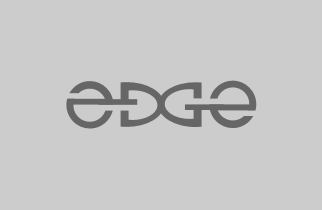
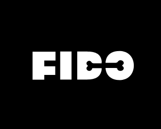
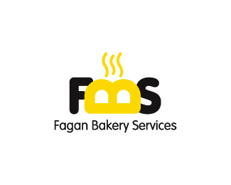
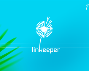
Logos are the distinction marks, which we get to see everywhere. The simple is a logo; the greater is the probability that your potential clients will remember you for a long time. However, manipulating a simple concept into a catchy and unique logo is a very challenging job.

Therefore, I have collected a bunch of 20 simple but creative logos, to show the current trend in modern logo design. All these concepts are memorable, clever and ….simple that will help designers get the maximum inspiration for trendy logo design.

 
4 Views
Bananas Films
 
 
Tuatra
Ashley-The Music
 
 
Nusica
Hand Therapy
 
 
Event Management
Up
 
 
TalkMore
Little People
 
 
EDGE
Ross Poultry
 
 
FIDO
Fagan Bakery Services
 
 
Link Keeper
Radermacher’s
 
 
FLO
I Can Fly
 
 
A Maze
Fun Stuff
 
Hey guys, It will be a real fun if you recommend me more simple yet creative logos, I am sure there are many more to be added to this list. By the way, which of these you liked the best??
Anyways, don’t forget to share with us if any of these logos inspired you to come up with a unique creation :)
 

  1. 20 logos simples y creativos — Tablosign On November 17th, 2008 at 9:23 pm
    1

    [...] 20 logos simples y creativos 0 # [...]

  1. Hisham On November 18th, 2008 at 3:32 am
    2

    This is a very nice collection, thanks for the effort!

  1. Abemearible On November 18th, 2008 at 11:29 pm
    3

    At the ends of the earth :)

  1. Zack M On November 24th, 2008 at 2:58 am
    4

    I really like Nusica. I Googled it and figure out what it is.

  1. Advertising Fizz On November 26th, 2008 at 2:27 am
    5

    Logo Design: Simple is Effective…

    When it comes to memorable logos, the ones that are easily recognizable and remembered are the most simple. Think about it: what could be more simple than Target’s red bulls eye? Or the Nike swoosh? Both simple and both very effective logos.

  1. Booklet Printing | PrintPlace.com On November 26th, 2008 at 2:35 am
    6

    My faves are the Event Management watermelon that looks like a stage and a watermelon; and the Ashley music logo. I think I like them b/c they incorporate something in their name or industry clearly into their logos. I like the Amaze one, but I was looking for the word “amaze” to show up in the maze. I didn’t see it and was disappointed. I think that would make the “amaze” one the best if they did that!

  1. internet strani On January 10th, 2010 at 12:17 pm
    7

    Excellent stuff.


Write for us
  • Top 10 Designers Projects Won
    AbsolutMudd
    217
    ACEdesign
    208
    finaldesign
    198
    neonlite
    192
    vector
    179
    x3mart
    158
    XtremeCreative2
    130
    Sergem
    124
    lakshmiks
    116
    jaggu
    99


Recent Post

Categories

Archives

  • Popular Posts

  •