istanbul evden eve nakliyat
X

Being a Female, What is your Clothing Style?


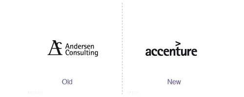
For those of you who have not come through my earlier post on ‘Rebranding cost of famous brands’, here is a preview of what this post is about. A few weeks ago, I did a post that featured the costs of rebranding famous brands like PEPSI, BP and Accenture. I received an overwhelming response, both positive and negative, from my valued readers.

While many were of the opinion that the rebranding costs were exorbitant. Many graphic designers and people from graphic design field rebuked by asserting that rebranding costs are justifiable based on the amount of work and processes entailed. This debate compelled me into writing a sequel post on rebranding and its aftermath.


When is Rebranding a mistake?

  • When you rebrand just for the sake of it, thinking you feel like rebranding just isn’t sufficient to overhaul the images of your brand.
  • When your customers are devoted to your previous brand identity and are more faithful to it, rebranding may lose brand loyal customers.
  • When rebranding does not reap proportional benefits and costs more than it pays.
  • When you rebrand because your competitor did so, you are making a mistake of rebranding without purpose.
  • When you rebrand without adequate research, repositioning the image without studying consumer demographics and psychographics is dangerous.
  • When you think that rebranding only means a logo redesign, or altering the stationery and corporate colors. Rebranding entails a whole bundle of intangible items that are needed to be considered as well.


Which is the right time for Rebranding?

  • When your brand equity is deteriorating or stagnant, that indicates you need a thorough rebranding to overhaul the identity of your brand.
  • When your customers don’t seem to favor your brand identity anymore, it’s time that you reposition your brand in the minds of your consumers.
  • When your brand gets caught up in a controversy, a repositioning is required to improve the tarnished reputation.
  • When the rebranding has the muscle to offset the cost it incurs, meaning it has the potential to pay off in the long run.
  • When you realize that your current brand positioning isn’t valid for the target market anymore, or your target market changes.
 

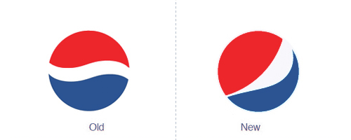
How well have famous rebranding performed?

In my previous post, I received quite a bit of complaints from some of the visitors saying that I did not properly analyze the cost of rebranding. Thus I would like to make an effort this time around to examine one of the most famous rebranding, that of Pepsi. In the end, you can be the judge if the rebranding is acceptable or not.


Pepsi Rebranding – A comprehensive Analysis:

The Pepsi rebranding was handled by Arnell Group. Its three years strategy involves $1.2 billion, a complete packaging, merchandising and marketing overhaul of its soft drinks. Let me remind my readers that the total brand value of Pepsi is estimate around $ 16 billion as compared to Coca-Cola’s $68 billion. The rebranding amount involves all kinds of promotional and ATL and BTL marketing activities. Now let us analyze the impact of the rebranding. It has been one year since the overhaul took place. There are no figures of ‘out of the blue’ sales jump or consumer liking about the rebranding reported. On the contrary, Pepsi has received far more censure than any other brands for its directionless rebranding. The real question is…the sales that Pepsi is generating now, are they more than what they would have earned without the rebranding?


Your turn to speak up!

It’s not only Pepsi which has undergone major rebranding…many other top brands like AOL, ANZ and BBC have taken the risk of rebranding as well. Do you think that they have really reaped the benefits of their rebranding efforts?
 

  1. prosist On September 14th, 2010 at 8:57 am
    1

    I like more the old Pepsi logo… Wow Coca-Cola = $68 billion… a lots of money compared to Pepsi’s $ 16 billion

  1. links for 2010-09-14 | random thoughts and casual ruminations On September 14th, 2010 at 9:30 am
    2

    [...] Is Rebranding a Mistake – Think before you leap! [...]

  1. Reza On September 14th, 2010 at 4:42 pm
    3

    Very informative and helpful. Thaks very much.

  1. Shevaa On September 14th, 2010 at 11:14 pm
    4

    Very Useful Article

  1. Sonja Meyer On September 15th, 2010 at 12:04 am
    5

    Personally I think they made a mistake somewhere.
    I remember my very first thought upon seeing the new Pepsi logo on a can was “oh, Pepsi have done a rebrand, too bad they have just used a clean sans serif font for their new logo and a change of the swirl as if to look ‘fresh’ like everybody else has done in the past decade. Nothing new and I refuse to be fooled.” I think if they had some sort of new philosophy being advertised along with the new image then it would have bothered me less. But as it was, it seemed visionless and therefore the ‘money hungry’ factor of the rebrand stood out to me too much.

    Sonja

  1. irakari On September 15th, 2010 at 2:24 am
    6

    Agree with the authors that the re-branding - it is not only changing the logo and corporate identity. Rebranding - a systemic change brand.

  1. Dzinepress On September 15th, 2010 at 6:13 am
    7

    interesting article.

  1. adroid85 On September 15th, 2010 at 11:47 am
    8

    The Pepsi re-branding will only widen the gap between itself and Coca-Cola. I was comfortable with and like the old look and feel of Pepsi. The direction and look they chose feels off. I would imagine the reasons for re-branding was to try and gain share on Coca-Cola and it would seem reason enough but nevertheless it just doesn’t feel right.

  1. pmp213 On September 15th, 2010 at 12:07 pm
    9

    I hope you realize that your so-called “comprehensive analysis” would fit into less than seven tweets. Pretentious much?

  1. samo On September 15th, 2010 at 12:32 pm
    10

    Let’s not forget that Pepsico, Pepsi’s parent company, also maintains a potfolio including brands such as: Quaker, Tropicana, Gatorade, and Frito-Lay (Which includes Doritos, Lays, Ruffles, and a variety of other snack products). Pepsico, as a whole, was actually ranked higher than coca-cola in fortune 500′s annual list of companies with Pepsico being ranked #50 and coca-cola being ranked #72. Reported sales revenues were $43.2 billion for Pepsico, compared to $30.9 billion for Coca-cola.

  1. Al On September 15th, 2010 at 12:52 pm
    11

    I’ve always really disliked the new Pepsi brand. It seriously alway reminds me of someones fat stomach…bad idea as the initial first thought when you look at the brand is not good.

  1. Michelle On September 15th, 2010 at 1:20 pm
    12

    I think rebranding can be positive, but if a lot of damage has already been done (e.g. BP) then it might not help at all.

  1. sittle On September 15th, 2010 at 2:01 pm
    13

    Pepsi so missed the mark…. Wow, Arnell Group sold crates of snake Oil to Pepsi.

  1. David - Web Designer On September 15th, 2010 at 2:16 pm
    14

    Another interesting post, the biggest re-brand i can recall was for the BBC.

  1. G On September 15th, 2010 at 2:17 pm
    15

    I think BBC America is doing an excellent marketing job and coming across as a solid source of information and entertainment without being condescending, distant, or arrogant to its audience.

    Pepsi, on the other hand, I didn’t even notice when they re-branded - if people care that much about soft drinks, then this world is close to the end.

  1. Hunter On September 15th, 2010 at 2:31 pm
    16

    Great article, thanks.

  1. MLinke On September 15th, 2010 at 2:45 pm
    17

    I personally hate the new pepsi logo.

    Rebranding makes sense when you’re taking dated design and reimagining it to compete with modern aesthetic. The old pepsi logo was everything a logo and a symbol should be, as does the new one. The problem is that pepsi payed $1.2 billion to get rid of a perfectly good logo and exchange it for one that’s just as good.

  1. Josh4rim On September 15th, 2010 at 3:15 pm
    18

    Actually BP merged with Amoco as a result of the merger came the new logo which incorporated both Amoco’s logo and BP’s logo. In doing this they were attempting to identify themselves to both loyalties.

  1. Michael On September 15th, 2010 at 3:56 pm
    19

    I like the article but the Interbrand measurement is not credible. (I dont understand why so many people accept it as credible…read Interbrand’s methodology. I guess if something is published in Business Week, herd mentality follows.) Sure Coke’s brand is worth more than Pepsi’s but not $50 billion more. By the way, Coke’s market cap is $40billion more than Pepsi’s.

  1. Jake On September 15th, 2010 at 4:03 pm
    20

    Probably unforeseen danger of the Pepsi rebrand. http://www.rishio.com/galleries/2009/misc/pepsi2.jpg

  1. Tucson Mortgage Dir On September 15th, 2010 at 5:10 pm
    21

    The costs are so staggering I could see it as a move to save a company’s reputation but otherwise I’m not sure its worth it.

  1. Moojj On September 15th, 2010 at 6:52 pm
    22

    The new pepsi logo looks like a guy with a fat gut

  1. web design geek On September 15th, 2010 at 11:30 pm
    23

    nice article very informative…

  1. Ryan O On September 16th, 2010 at 6:58 am
    24

    To the author- a very interesting post. I too am of the school that the constant brand logo changes damages the “brand equity.” That being said, both Pepsi and Coke have had fairly similar positionings over time.

    To Michael’s point, I agree somewhat with you. The Interbrand measure might not be accurate in terms of $ value, but it does somehow accurately capture the ranking of the brands that are stronger than others. Compare Coke and Pepsi’s rankings at http://www.brandmojo.org (they rank the most loved brands there) and you will see Coke is ranked 20something and Pepsi 340. http://www.brandtags.net also shows that Coke has more more-favorable associations than Pepsi. So Interbrand is doing something right because these measures tend to align. But Pepsi’s constant “logo redesigns” can’t help.

    Cool comment Josh- I never knew that. Personally I think that creating a new “brand” via merger should be done over time, like Unilever did with its heart logo for ice creams. (Cool case study)

  1. Matin On September 17th, 2010 at 2:49 am
    25

    I like the new pepsi brand better. nice post!!

  1. Internet Evolution - Executive Clan Editor's Blog - Enterprises Struggle With Brand Equity On September 17th, 2010 at 7:09 am
    26

    [...] extreme cases, should an enterprise call for a brand overhaul? It's a tricky subject to be sure, according to a recent graphic design blog post. After debating the rebranding cost of [...]

  1. Eoin White On September 22nd, 2010 at 5:40 pm
    27

    BP didn’t have a rebrand. They simply had a brand identity redesign. Same goes for most of the examples.

  1. Egidius Heerkens On September 23rd, 2010 at 9:07 am
    28

    On the face of it, a lot of re-branding, like the pepsi changes, are mere tweaks of an old theme.
    Best Regards Egidius Heerkens

  1. Graphic Design Toronto On September 24th, 2010 at 1:30 am
    29

    i like old one logo of Pepsi new one is not so good as compare to old one

  1. Web Design Company On September 28th, 2010 at 6:09 am
    30

    I like New Logo of Pepsi, Old logo of Pepsi was Completely Out of Fashion :)

  1. David Christian-Woodruff On October 14th, 2010 at 3:17 am
    31

    I’d agree that Pepsi went in the wrong direction when re-branding. Their mark was known pretty much around the globe… had someone shown me their new one, I might have had to think twice before actually knowing what it was; a sign of a poor re-brand.
    I’ve said it before, too many companies rush into a “re-branding” because they feel that they need to keep up with the changing world around them. Now some, such as the BP example, needed one as there logo was looking dated, however there are some, like Pepsi and Argos who have gone too far and missed the boat on what is required from a re-brand.

  1. Professional Website Design On January 13th, 2011 at 7:47 am
    32

    Accenture’s new logo is cool as compare to old one

  1. Interior design On January 28th, 2011 at 4:08 pm
    33

    I like the new pepsi ‘s logo, it’s inspiring!

  1. Алуминиеви Паратети Варна On October 1st, 2011 at 1:11 pm
    34

    I like the new Pepsi brand better!

  1. W|Hue » The Re-branding of Christianity On February 19th, 2012 at 8:30 pm
    35

    [...] a pretty big hunk when the company’s net value is around 16 billion. Read a quote from an entry on graphicdesignblog.org There are no figures of ‘out of the blue’ sales jump or consumer [...]

  1. The Re-branding of Christianity | WilliamHAdams.com On May 15th, 2012 at 6:41 pm
    36

    [...] That’s a pretty big hunk when the company’s net value is around 16 billion. Read a quote from an entry on [...]


Write for us
  • Top 10 Designers Projects Won
    AbsolutMudd
    217
    ACEdesign
    208
    finaldesign
    198
    neonlite
    192
    vector
    179
    x3mart
    158
    XtremeCreative2
    130
    Sergem
    124
    lakshmiks
    116
    jaggu
    99


Recent Post

Categories

Archives

  • Popular Posts

  •