A logo is the base of a company’s brand identity and global recognition but with change in time and growing competition, companies have started sprucing up their logos. A logo redesign is a risk, which can turn in loads of success for you if you get it right but if you come up with some unpleasant redesign, then better be ready to loose the brand identity you have achieved already.
The redesigning is such a crucial process that you never know if you are freshening up your design in a simple way or taking a step backwards with a redesign. But history have witnessed some of the great redesigned logos in which few of them proved to be a huge re-vamp of a company while some companies paid a big price for changing their logos.
I’m posting a few logos you’re all familiar with along side their redesign. I am curious what everyone thinks of the new looks…were these changes for good or worse and why?
AT&T Logo:
This brand has been around strong for a long time and this subtle change has made a great difference.
MindShare Logo:
Change in colors and fonts have contributed largely to the logo.
Toys ‘R’ Us Logo:
A star has been stuffed into the engorged R in order to make it look more bulbous and fun loving.

Sprint Logo:
Redesign is a pleasant change here, I guess!
Vicks Logo:
The new logo is conveying the sensible feel of the brand.
Burger King Logo:
The logo was changed to make the franchise look more happening and trendy.
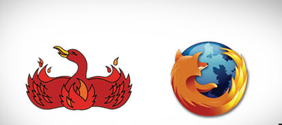
FireFox Logo:
The changed logo explains the name well, “fox” and “fire”.
Pizza Hut Logo:
Long time back change but maybe the best amongst redesigns of the century.

Discovery Channel Logo:
Elements have been replaced beautifully.

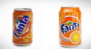
Fanta Logo:
The new logo has given a new look to the drink.
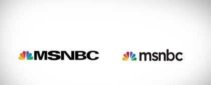
MSNBC Logo:
The evident difference in that the new logo has lost the old school CAPS LOCK.
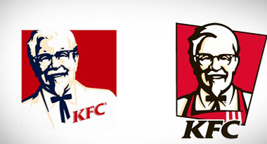
KFC Logo:
Alongwith brightening of colors addition of the apron of Colonel Sanders is giving a cleaner look.
Science Channel Logo:
The channel is known for screening science related shows, so the “periodic table” look is well used in the new look.

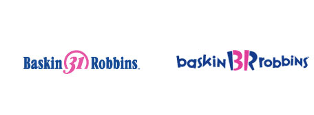
Robin Baskin Logo:
The new logo may appeal to kids more as it is more funky and cool.
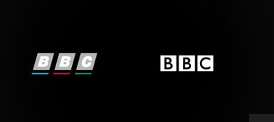
BBC Logo:
I find it unique in every way, what say?
So my logo designer friends, which of these redesigned logos you find appealing and which you think looked better in their older version?
I haven’t listed any recent logo redesign, so do let me know if you know any brand which has got its logo revamped lately…I will be really thankful ![]()
PS: Below are the sites and blogs I used to research this compile these redesigns:
http://wefunction.com/2008/10/50-stunning-examples-of-a-great-redesign/
http://www.logodesignlove.com/10-successful-logo-redesigns
http://www.kulturblog.com/2006/01/your-favorite-logos-redesigned/


Very interesting look at redesign. One bad example (or at least it bugs me) is the recent redesign of the Animal Planet logo. By recent, I think it was launched at the beginning of 08 but I still felt it lost a lot of branding juice, so to speak.
Google search found it here: http://www.underconsideration.com/brandnew/archives/animal_planet_logo.gif