


 |
|
I know what you guys must be thinking…how minimal designing could be bad? But don’t get me wrong here, I just wish to explore the negative aspects of a trend that is roaring in the graphic design world for past decades. Although, I completely agree when said "Simplicity is the ultimate sophistication" but not every design venture can survive minimal designing. Minimalism is a trend in graphic designing that involves stripping down the design to its most basic features. Although minimalism is percieved as an effortless task but only graphic designers know it isn’t that easy. Minimalism involves extreme conceptualism and abstraction. But then again, there are pros and cons of everything in this world. |
Minimalism or Laziness – Is it all the same?Minimalism if adopted without any relevance and purpose can be very damaging. Sometimes, just to get the thing off our shoulders, graphic designers pass off a mediocre design as minimalism. SO let us see how minimalism can become harmful? |
1. It’s the ‘IN’ thing, so I MUST go for it:The most common motive that we hear for minimalist design is that, they are the ‘IN’ thing. While I completely agree to the fact that minimalism is a popular trend, but it has its limits. Consider this business card. Don’t you think there are too less details on it? No contact number, no address, not an email id. What is the point of a business card if your client is not getting the complete information about your business? |
2. Its easy for novice web users…Is it?So it is true that a novice web user would find difficulty in accessing a detailed website, hence minimalist website design will be easy for them. But keeping it too minimal fails to convey your business purpose and creates a false impression on your customers. The purpose of a website is to facilitate customers and inform of your services. What’s the purpose of a websites if it does not clearly explain what services your business has to offer? |
 |
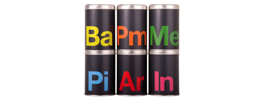
3. Details create clutter…even the important ones?Anything excessive is damaging, be it minimalism or adding details to a design. While it is true that too much clutter in a design can create a messy design, but going too minimal fails to reach targeted audience. Have a look at this package design that shows nothing but two alphabets denoting the flavor of a salt, which are inspired from the periodic table of elements. I know my Chemistry is horrible, but how can one expect a common man to understand this concept? |
 |
4. Explanation creates confusion…really?There is a difference between cluttered and content-rich design. Sometimes, designers simply opt for minimal concepts because it leaves very less chances for them to be wrong. Although it is true that unnecessary design elements can create a mess, but an informative design is also necessary in explaining the clients about your business. Have a look at this minimalist print ad…it is so minimal that I’m sure most of you might not recognize the company who is advertising in the first place. |
 |
5. Simple is creative – Is it always?As I said earlier, I do agree that simple is sweet and it is considered as creative. But what is the point of minimalism if it does not accurately communicate the purpose to the target audience? Observe the logo above and decide is it really a creative logo? To be honest, I didn’t find anything fascinating about it. You can’t tell what industry this logo is for, what company is it made for or what does it signify. |
|
|
You decide – Is it Minimalism or Lazy Designing?I know designing minimal things is not an easy task and takes a lot more effort than designing normal designs. But don’t you think when the message is not properly conveyed, it looks as if the graphic designer has been lazy not spending enough time on the concept. What do you think? |


Thank you for bringing this up. Nothing is more annoying to me when I see an ad for a restaurant or a place I find intriguing than to not have an address or phone number listed. When I am perusing ads, I want to know right then if it’s near enough to my house for me to consider patronizing and not have to go home and pull it up on my computer because all that was given was a web address. I think many businesses lose customers that way. Luckily, this too is a fad, and will eventually go by the wayside.